Editor Guide
Editor controls and the small-size workflow.
The editor is built around one constraint: the icon has to read at 16–32px. Everything else follows from that.
Controls
- Background — solid or gradient
- Motif — SVG icon or character (letter / symbol)
- Padding & scale — breathing room around the motif
- Foreground color
- Effects — stroke, outline, glow, shadow (optional)
Workflow
- Solid background, single-color motif. Skip effects.
- Increase padding until the motif has room.
- Check the 16px and 32px previews. If it doesn't read here, no effect will fix it.
- Add effects only if the base already works small.
- Export and verify on the real surface (browser tab, home screen, launcher). The preview is not a guarantee.
If small sizes look blurry, the fix is almost always more contrast and more padding — not more effects. Thin strokes and fine serifs disappear at 16px; prefer fewer, bolder shapes. Gradients tend to muddy. If a character motif doesn't look like the font you picked, see Typography & Fonts.
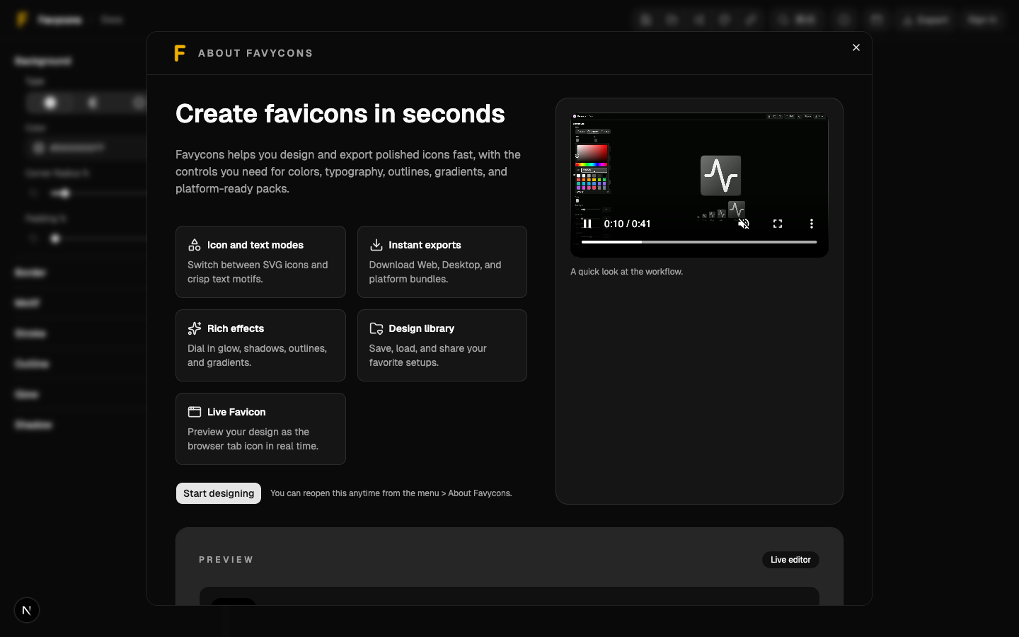
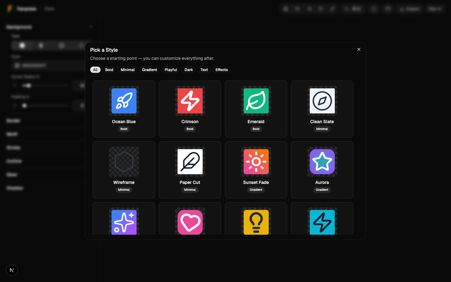
Styles Gallery
A style is everything but the motif — colors, gradients, padding, radius, rotation, stroke, outline, glow, shadow, typography. Applying a style swaps the look and keeps your icon or letter in place. It overwrites current settings, so save first if you want both.
Open it from the Styles button in the header or the command palette (⌘T / Ctrl+T).
Editor overview